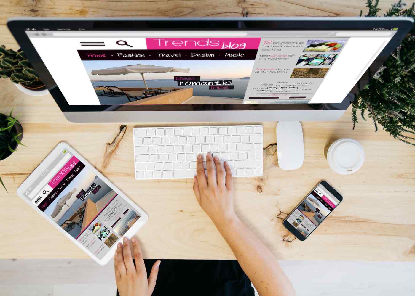
Media queries are a powerful tool for creating responsive
websites. They allow developers to deliver different CSS styles based on the
size of the user's device and viewport, allowing them to create a tailored
experience for each individual user. Media queries use conditional logic to
determine when certain rules should be applied or ignored, which allows
developers to create complex yet elegant designs that look great no matter what
device they™re viewed on. By using media queries, developers can specify breakpoints
at which their design will change depending on the screen size and orientation
of the device being used. This ensures that all content is accessible across
any type of device without sacrificing visual appeal or functionality.
Benefits of using Media Queries
Media queries are a great way for developers to create an
experience that looks and functions perfectly across all types of devices.
Responsive design has become increasingly important in today's online world, as
users expect websites to look good no matter the device they're viewing them on.
By using media queries, developers can ensure that their website looks great on
any size screen or orientation by applying different CSS rules depending on the
user's device and viewport. This means that content is accessible to everyone,
regardless of whether they access your site from a desktop computer, smartphone
or tablet.
Another benefit of using media queries is providing a device-agnostic experience. By adjusting elements based on the user's particular display, you can make sure each visitor has an optimal experience no matter what type of device they use to visit your website. This allows you to create designs tailored specifically for mobile phones or tablets without sacrificing usability or readability when viewed from other devices like laptops and desktops. Additionally, this approach makes it easier to maintain one codebase instead of having multiple versions optimized for different platforms which saves time and effort during development and maintenance cycles.

Understanding Media Query Syntax
Media queries use Boolean logic to evaluate expressions and
determine whether certain rules should be applied or ignored. A boolean
expression is a statement that evaluates as either true or false, allowing
developers to create complex conditions in their media query syntax. The most
common operators used with media queries are and (&), not (!), only (|) and
comma (,). By using these logical operators, developers can specify multiple
conditions for determining when a rule should apply. For example, you could set
up a rule that applies if the viewport width is greater than 800px AND the
device orientation is landscape OR the viewport width is less than 500px.
In addition to using Boolean logic, media queries also
support various comparison types like min-width/max-width,
min-height/max-height etc., which allow developers to control how their design
responds on different devices without having to manually adjust each individual
element's properties. This allows them to easily customize designs based on
device type while still maintaining an optimized look across all platforms.
It™s important to note that browser support for
media queries varies from one platform to another so it™s always best practice
to test your code before deploying it live. By testing your site on different
browsers and devices you can ensure that all of your content looks great no
matter what platform viewers may be using at any given time.
Working With Media Queries
Breakpoints are an important part of creating effective
media queries. They determine when certain rules should be applied or ignored
in order to create an optimal user experience for the device being used.
Breakpoints are typically set in pixels, but they can also be set using ems or
rems depending on your project™s needs. Setting breakpoints allows developers
to design websites with specific layouts and content that look great no matter
what type of device or viewport size is being used. This ensures that users get
a tailored experience regardless of their platform, saving you time and effort
during development cycles while still providing a great user experience across
all platforms.
Conditional rules allow developers to specify which styles will be applied at different breakpoints, giving them more control over the overall design process. By using these conditional statements, designers can make sure that their website looks good on any screen size without having to manually adjust each individual element's properties every time there is a change in device orientation or viewport size. Conditional logic helps ensure consistency throughout the site by applying only the necessary changes based on defined breakpoints so users always get an optimized version of your site regardless of their platform choice.

Responsive Design Tools
CSS-grid frameworks are a great way to quickly create
responsive designs without having to write a lot of code. They provide an
easy-to-use grid structure for developers that allows them to easily build
mobile, tablet and desktop layouts with just a few lines of code. By using
these frameworks, developers can reduce the amount of time spent on development
cycles while still providing users with an optimized experience no matter which
device they™re viewing it from. Grid frameworks also make it easier to maintain
consistent design patterns across multiple devices as all changes can be made
in one place instead of needing to be adjusted individually for each platform.
Preprocessors are another useful tool for creating
responsive websites. Preprocessors like Sass and Less allow developers to
simplify their CSS by writing short snippets that compile into full stylesheets
when needed. This gives them more control over how their site looks on
different devices without having to manually adjust individual element
properties every time there is a change in device orientation or viewport size.
Additionally, preprocessors give designers access to powerful features such as
variables, mixins and nesting which makes complex design patterns much simpler
and quicker than ever before.
Conclusion
Responsive design is essential for creating an optimal
experience for every user regardless of the device they use to visit a website.
Media queries are a powerful tool that allows developers to create complex
designs tailored specifically for different screen sizes and orientations
without sacrificing functionality or readability. They also provide access to
features such as conditional logic and comparison types which give designers
more control over how their site looks on different devices. Additionally,
frameworks like CSS-grid and preprocessors like Sass/Less can be used to
quickly create responsive designs while still maintaining consistency across
platforms. By leveraging the power of media queries, developers can ensure that
all users get an optimized experience no matter what type of device they™re
using when visiting your website.
If you wish to contribute to our blog, please email us on morhadotsan@gmail.com.


